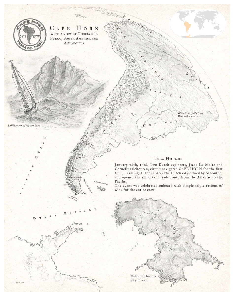
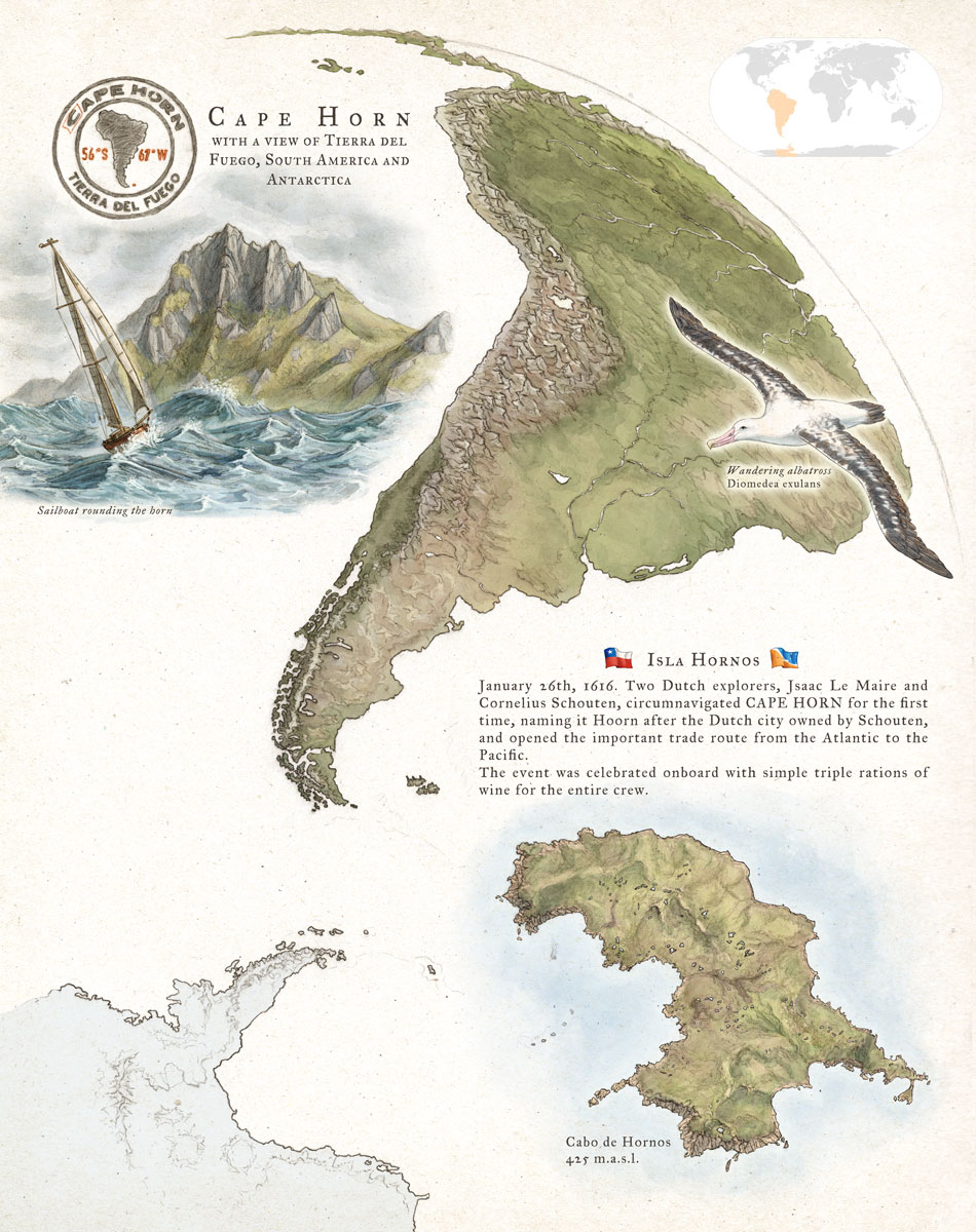
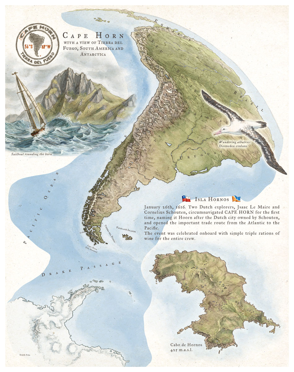
In mid 2016 I was commissioned by Cape Horn, an outdoor clothing brand from Italy, to create a celebratory map for the 400th anniversary of the discovery of Cape Horn.
On January 29th 1616, the Dutch merchant ship ‘Eendracht’ rounded Cape Horn, the southern-most point of South America, thus opening the important trade route from the Atlantic to the Pacific.

The complexity of the piece called for a carefully pre-planned process, in order to avoid unpleasant surprises along the way.
In this post I’ll briefly go over all the steps, from research to final illustration, hoping it might be of any interest.
I. CONCEPT
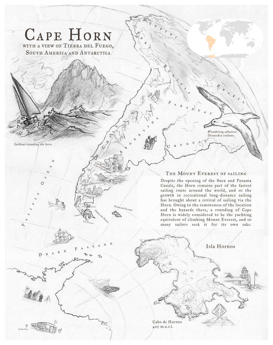
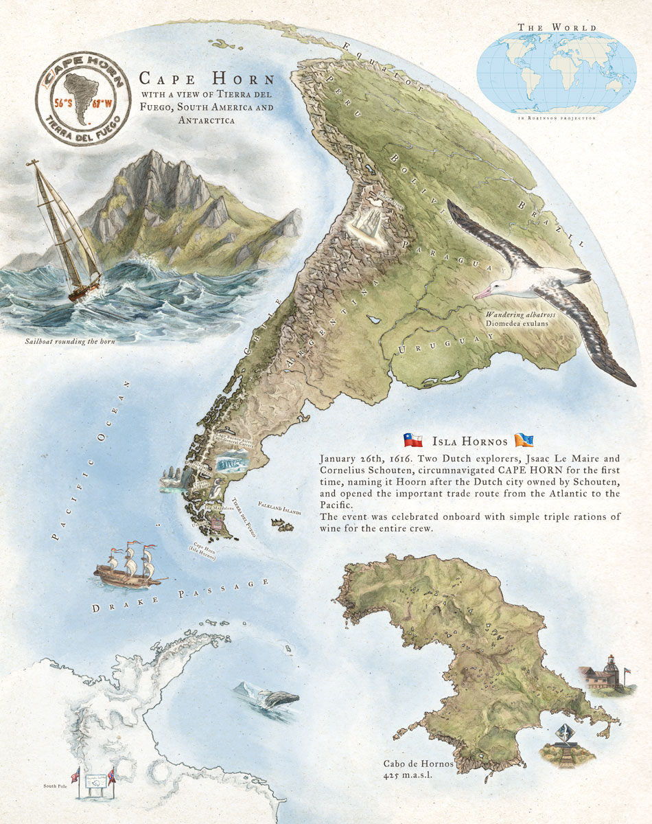
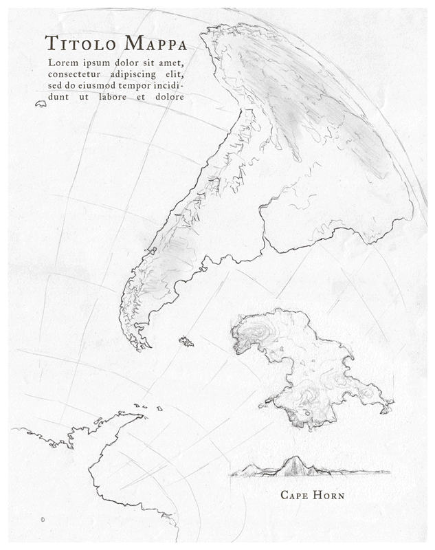
The aim of the project was to create a celebratory and richly illustrated map of Tierra del Fuego – with a broader view over Antarctica and South America – and with small illustrations highlighting several geographical, cultural, and historical points of interests of the region.
The main sources of inspirations were Richard Edes Harrison’s approach to cartography – hence the ‘globular’ perspective of the map – and the famous illustrated infographics of National Geographic Magazine.
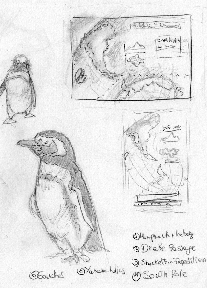
After extensive research on all elements that will be featured, it’s finally time to start designing the illustration. A thumbnailing session (1) gives me a rough idea of the general layout. Choosing between a portrait and a landscape composition was hard, given the orientation and the globular perspective of the main map. The composition also needed to allow enough for room to place the secondary elements (text, illustrations, logo, and so on…) without cluttering the whole canvas.
II. ROUGH
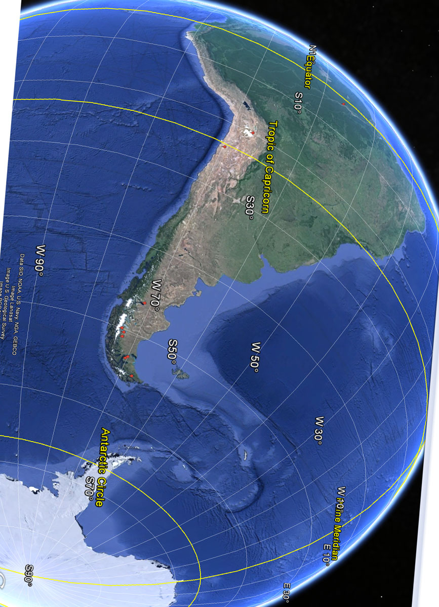
After settling for portrait orientation, I moved on to tackle my primary concern of the whole project: how to get a geographically-accurate-yet-artistically-appealing perspective of South America and Antarctica, while focusing on the Tierra del Fuego region AND leaving enough room for everything else.
Fortunately enough, Google Earth came to the rescue. After much tinkering with the app I managed to get the desired angle. I then screen captured (2), printed (on A3 paper) and traced it to get a sketch of the main map (3).
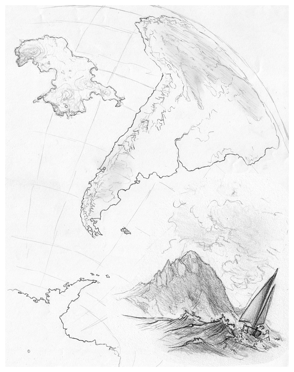
I then sketched all the secondary elements, scanned everything and composed it together in a PSD file. The artwork is supposed to be printed as large as possible, so I had to make sure my file was created at the appropriate size.
At this stage I also put in some placeholder text for both the geographical labels and the informational boxes.
I sent the sketch to the client and waited for feedback, which led to the boat illustration and the Isla Hornos detail map switching place, the informational box being moved to the center-right, and a world map being added to the upper-right corner.

III. FINALISING THE PENCILS
With the new layout being approved by the client it was time to start finalizing the behemot. All illustrations were hand-drawn in pencil on separate sheets, scanned, polished and prepped for digital colouring.
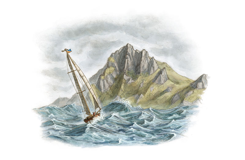
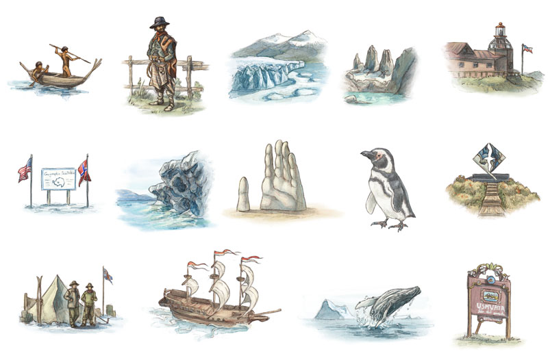
Here’s the full list of assets created:
- 1 main map (of South America and Antarctica)
- 1 boat illustration
- 1 detail map of Isla Hornos
- 1 pencil-rendered logo of the client
- 15 spot illustrations for the points of interest (including the bigger albatross)
- 2 flags
- 1 world map (done in QGis)
IV. ADDING COLOUR
For a smoother and less-painful painting process, I decided to finalise all the secondary illustrations in separate PSD files, and import them into the main map as I went along.
This meant I could freely move them around the main composition without having to worry about messing them up. It also helped keep the main file’s size a bit smaller.
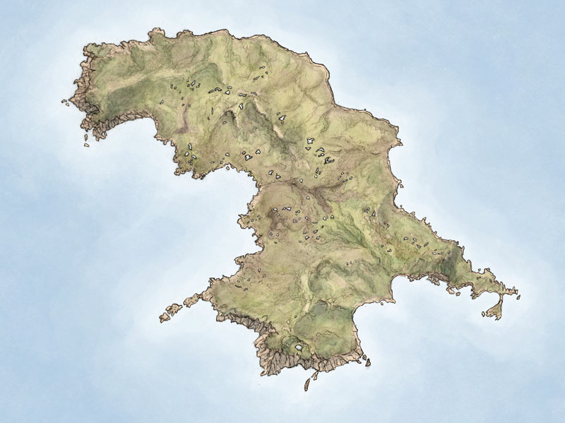
For the main map, I rendered the land masses first (4), and secondly the water on a separate layer (5), masking its edges (6) so it would blend nicely with the surrounding content.
V. DETAILS & FINAL TOUCHES
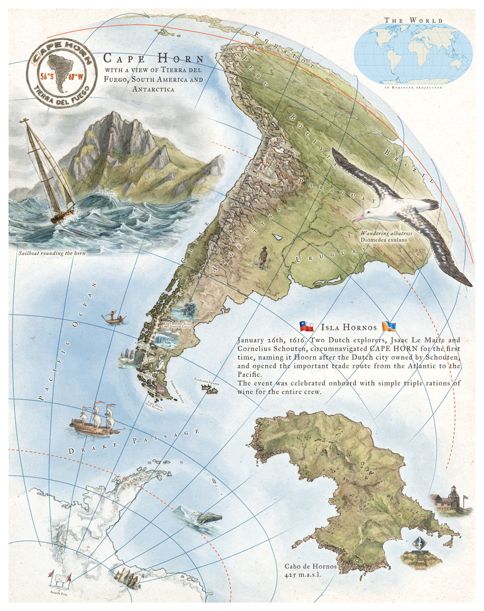
I then reproduced the grid (7) with Photoshop’s pen tool, tracing the initial screen capture from Google Earth for geographical accuracy. Once again I worked on the grid layer’s mask (8) to blend everything together.
The final stage of the process was to adjust all the labels and texts (font type, size, and the likes), adding details such as the wind rose and a nice paper texture for that ‘ancient’ feel we all love.
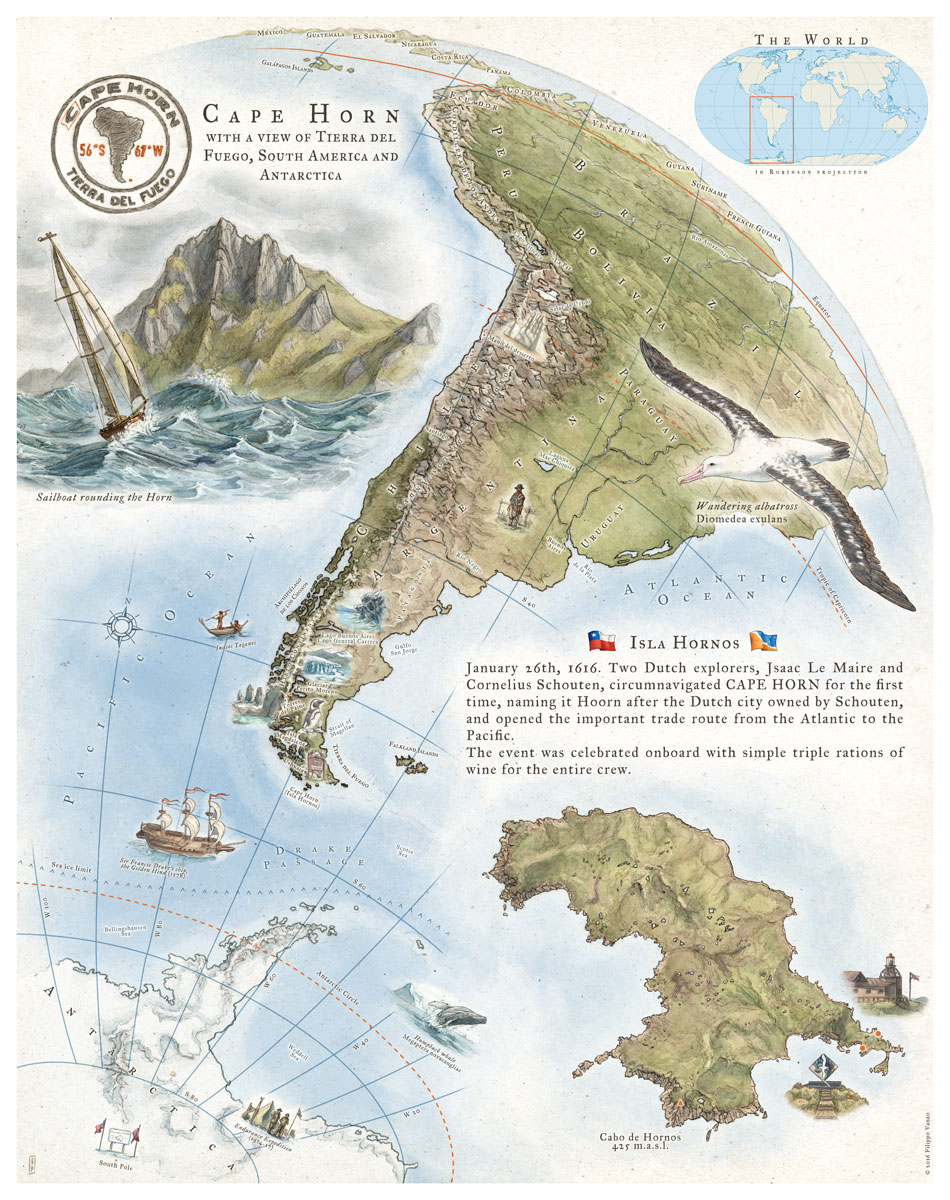
Lastly I sent a low-res version to the client for approval (9). Luckily enough the feedback entailed only a few minor changes, most notably removing the white border around the image (10).
CONCLUSIONS
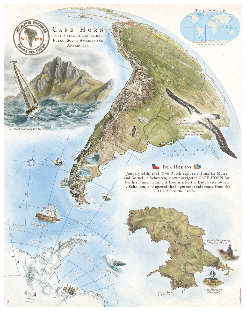
I’m pretty satisfied with how the piece turned out, considering the amount of careful designing it required, the scale and general complexity of the composition.
Lastly, here are some quick facts and a GIF of the entire process.
Tools: pencils (HB, 2B, 5B), mechanical pencil (HB), paper (150-220 gr), kneaded eraser
Software: Photoshop, Google Earth, QGis
Leave a Reply